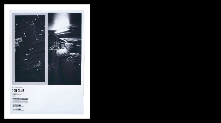
 It's been a while since I got the 100 club brief but I have finally got round to editing my final outcome slightly so that it would make it a better project. The set of three posters were designed for my final crit. The main concept behind them was to raise a debate amongst the public about the 100 club in an unobtrusive way... In doing this it meant it raised the profile of the club, to people who already knew about it and people dont. Each poster has the pattern of the 100 club floor perforated into the middle of them so that when someone rips one off it starts to create an effect of something falling apart (i.e. the 100 club closing and everything being ripped out of it), in a visually interesting way. within the posters there are two photos, one of a part of the 100 club close up and one of a general overview of something. however at the crit we discussed minor ways in which the poster could be made stronger. These were...
Less text, because people generally don't read something that small when they walk past it quickly.
Bigger 100 club sign, so that it was recognisable from a distance.
Make it more obvious that it was an interactive poster and that one panel is to SAVE the 100 club and the other is to SHUT the 100 club.
With these three things in my I have been working on a new improved version, which looks very similar but it just takes into account everyone had said at the crit, to make it conceptually and visually stronger all round.
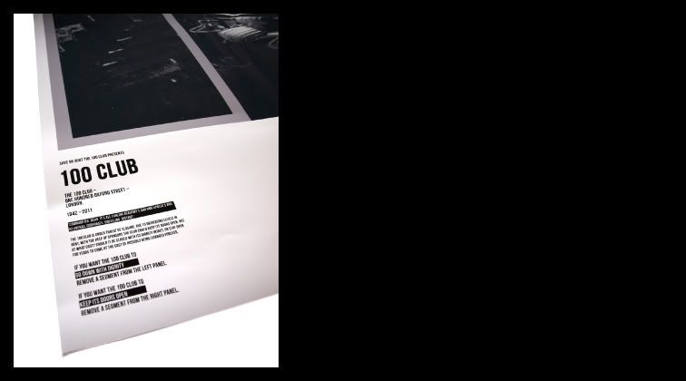 Here is a close up of the text, and you can just see the perforation that is within the poster.