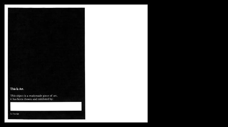
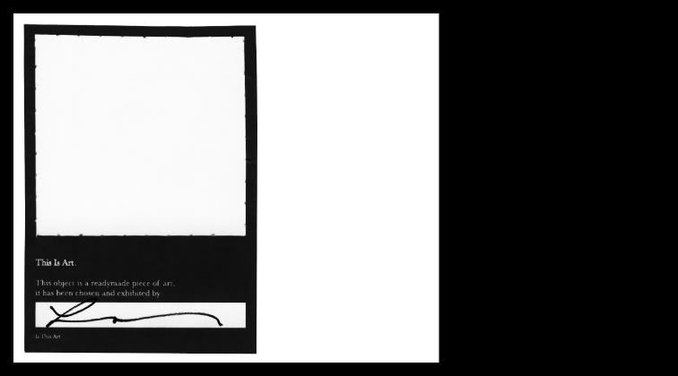
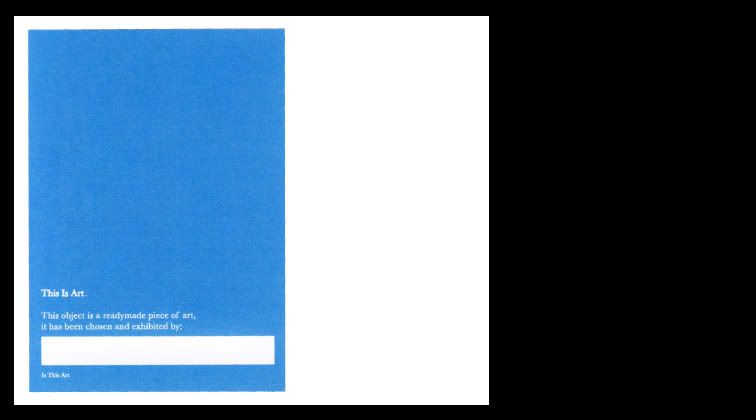
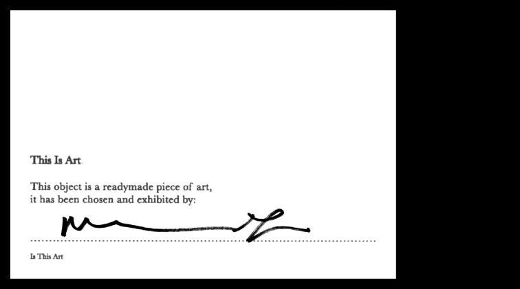
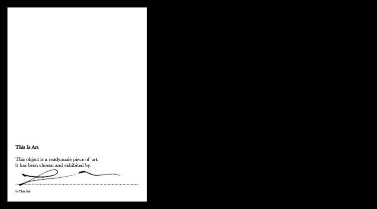
 Having re-looked at the 'Facility For Thought' work and looked at some more reference points I have decided to change both the format and the text that is on the sticker, only slightly but in the context of the design I guess its a pretty massive change. I have changed the name for a start to, 'This Is Art'... which is inspired by Bob and Roberta smith, in the way that it is straight to the point and not pretentious. I have kept the serif typeface of baskerville due to the fact that I think it is more unnoticeable as it were, most of the reference points I am looking at are in very blocky sans serif typefaces like trade gothic or something similar and I think I want to get away from that look. The third picture is of the sticker with a hole cut out of it, this is mimicking the poster idea that I have which I really like, but weather it works as a small sticker is another thing, but I think it has the potential to for sure. I also like the fact that after the signature it questions the piece that the sticker has been placed on with the simple question 'Is This Art' I think I may put this in brackets though due to the fact that its after the signature and is a question about it. Its pretty straight forward, but I think when it is coupled in a pack with the poster and hopefully a stamp it will all come together and make more of itself as a piece of work. I also have tried doing it in the blue colour, which again is an option that I could have, maybe I could have one saying 'This Is Art' 'This Is Design' that would be interesting.